06/08/2026
A grid of 47 tiles is a library, not a streaming app. The five rows that retain viewers, and why branded apps win where YouTube can't.
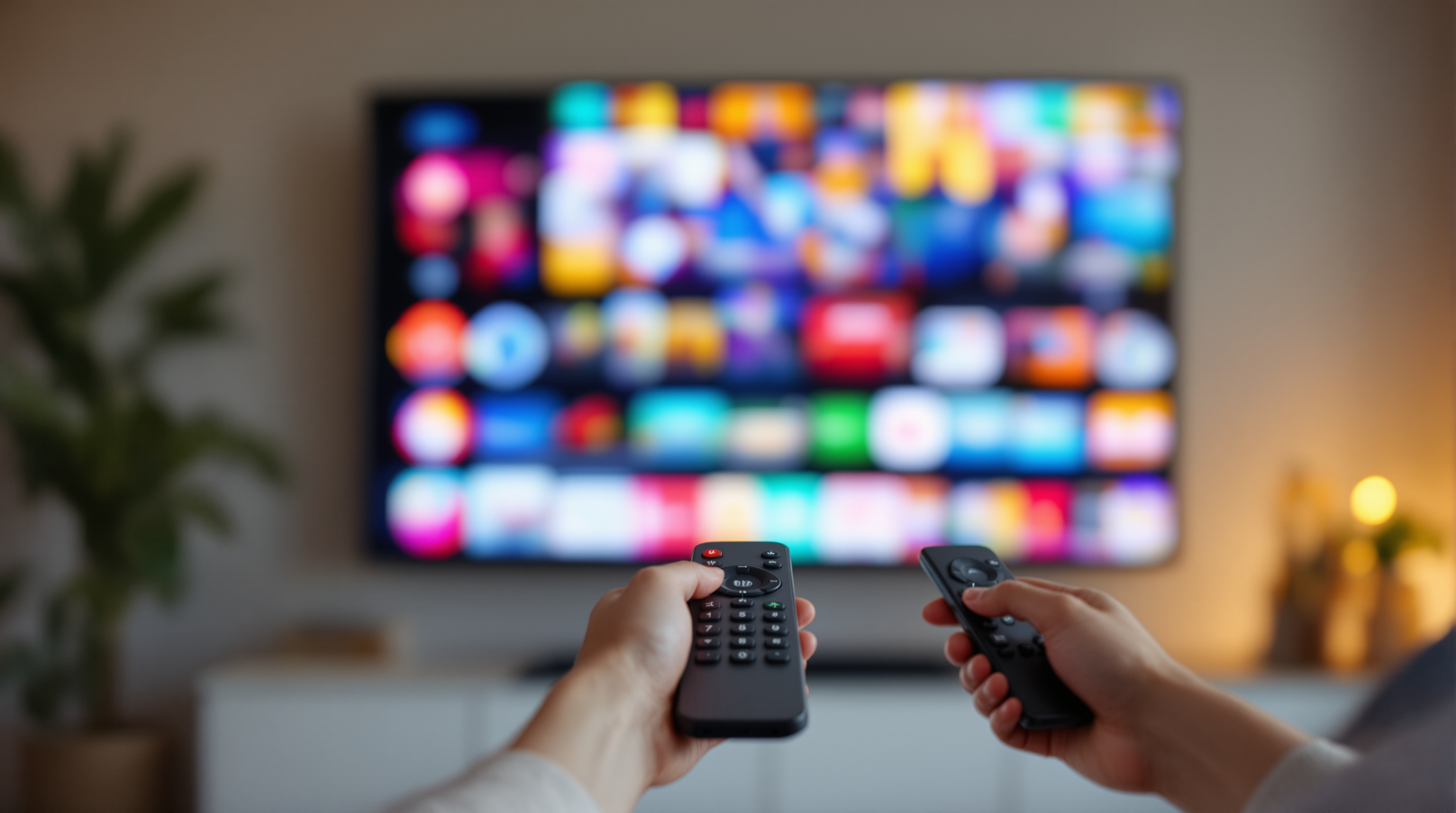
A grid of 47 video thumbnails is a library. It is not a streaming app.
Open Netflix. Disney+. Hulu. Apple TV. Any of them. You will not see a 47-tile grid. You will see rows. The first row, almost always, is "Continue Watching." Below that, two or three carefully chosen rails - what is new, what is trending, what someone curated for you this week. Below that, more rows, but not many more.
This is not a design fad. It is the difference between a website and a streaming experience. And most branded streaming apps - for churches, schools, conferences, fitness studios, civic chambers, music venues - get it wrong because the people building them think like webmasters.
The Grid Is a Website Pattern. Streaming Is Not a Website.
A website assumes you arrived with intent. You typed something. You clicked a link. You know roughly what you want. The grid is fine because you are scanning to confirm.
A streaming app assumes the opposite. The viewer is on the couch. The remote is one arm away. They opened the app to be told what to watch. If you make them browse, they will browse for about 90 seconds and then open something else.
This is called lean-back behavior, and it is the single biggest UX difference between web and connected TV. Web is lean-forward. Streaming is lean-back. The grid layout is a lean-forward pattern. The rail layout is a lean-back pattern.
When a branded app home screen looks like the homepage of a Vimeo channel - all tiles, no editorial - it is leaning forward at a viewer who is leaning back. That mismatch is what kills retention. Not bandwidth. Not content quality. Layout posture.
The Sweet Spot Is 8 to 15 Rows. Not 47 Tiles.
The shape that consistently works for streaming home screens is between eight and fifteen horizontal rows. That is the working sweet spot across the major streaming services and across the smaller branded apps that retain viewers well.
The rough recipe for the first five rows:
- Continue Watching. Always first. It is the most-clicked rail in any app that has it, because it removes a decision. If a viewer is mid-way through Tuesday night's class or last Sunday's sermon or Episode 3 of a four-part conference, the first thing they should see is their unfinished thing.
- New This Week. Whatever you posted in the last seven days. This is the rail that rewards regular viewers for coming back.
- Featured Right Now. Three to five hand-picked tiles. This is your editorial voice. Treat it like a TV programmer treats 8pm.
- Trending or Most Watched This Month. Social proof. People watch what other people watch.
- Topic rail. Pick a theme - "Yoga for Lower Back," "Council Meetings This Quarter," "Christmas Eve Services," "Sessions on AI in Education." Anything that gives the catalog narrative shape.
Below those five, you can fan out into your full library by category. But the first five rows are where retention actually lives.
Your First Row Is Worth More Than Your Last Eight
Eye-tracking on TV interfaces is brutal in a useful way. The first visible row, especially the first two or three tiles in that row, takes the overwhelming majority of clicks. Tiles below the fold barely exist. Tiles below the second fold may as well not exist.
This has a clear implication: the first row is the most expensive real estate in your entire app. Treat it that way.
If your first row is "all videos, sorted by date," you are throwing away the most valuable surface you own. If your first row is a hand-picked four tiles - something new, something timely, something familiar, something a first-time viewer would understand in a glance - you have actually built a streaming experience.
This is the part where teams from a web background tend to balk. "But it is editorial. We do not have time to curate." Yes, curating four tiles a week takes time. It also moves engagement more than any other single change you can make. It is, weirdly, the cheapest thing you can do with the highest payoff.
The Library Is Not the Home Page
Most branded streaming apps have one screen that tries to be both the home page and the library. It fails at both.
A library page is for someone who knows what they want. Search bar at the top. Filters by category, date, speaker, series, topic. Grid is fine here - even ideal - because the viewer is in lean-forward mode now.
A home page is for someone who does not know what they want. Curated rails. Editorial choices. No search bar at the top, or a small one to the side.
These are two different screens for two different mental modes. When you collapse them into one - usually because someone said "let us keep it simple" - neither mode works well. Lean-back viewers get overwhelmed by the catalog. Lean-forward viewers cannot find what they came for because the curation is in the way.
The fix is to build both, and link to the library from inside the home page. "See all classes." "Browse the full archive." "Find a session by date." The home page stays curated. The library stays searchable.
The 30-Second Test
There is a simple way to know whether your branded app home screen is doing its job. Open it cold, on a TV, with a new-viewer account. Set a 30-second timer.
In that 30 seconds, did you see:
- Something you would consider pressing play on?
- A sense of what is new this week?
- A familiar face, name, or topic that anchored the app for you?
If the answer to any of those is no, you have a home screen problem. You probably do not have a content problem. Most branded apps have plenty of content. They just present it as a wall instead of a story.
The first time a viewer opens your app on Roku or Apple TV is the only first time they will ever have. Whatever they see in those 30 seconds is what they will think your channel is. Make it something on purpose.
Why This Is Easier on a Branded App Than on YouTube
The reason most organizations have a half-curated streaming experience is that they live on YouTube or Vimeo, where the home page is whatever the platform decides. The "Latest Videos" tab is the only rail. You cannot put a curated featured row above it. You cannot push older content into a "best of" rail. You get the platform UI, and that is it.
A branded streaming app changes this. You own the home rails. You decide which video gets the hero tile this week. You decide whether Continue Watching is the first thing a returning viewer sees. You decide whether your live stream gets a banner or a button or nothing at all.
This is the actual reason "branded app" matters beyond the logo. It is not that the app has your name on the splash screen. It is that the home screen - the most important screen in any streaming product - is finally yours to program.
If you are running streaming under your organization name and your viewers currently land on whatever a third-party platform decides to show them, take a look at fluger.tv/registration. 14-day free trial, no card required, branded app on Roku and iOS, no Apple Developer account to set up. The home screen is yours. Program it on purpose.